range.css - generate styles for your HTML5 range inputs
Une appli qui permet de générer le CSS pour styler les input range... C'est joli en plus ! Hop, coudifié !


Une appli qui permet de générer le CSS pour styler les input range... C'est joli en plus ! Hop, coudifié !
Un truc que je teste sur ma page de générateur de comics pour masquer le chargement de la page...
Minimaliste...
/* Dans le Head */
<style type="text/css">body{opacity: 0;transition: opacity 1s}
/* balise body */
<body onload="document.body.style.opacity=1" >
Je suis fan de ces astuces minimalistes...
filter:drop-shadow(2px 4px 8px #585858); pour faire une ombre sur des images à fond transparent.scroll-behavior: smooth; pour activer le smooth scroll.center { display: flex; align-items: center; justify-content: center; } pour centrer horizontalement et verticalementwhite-space: nowrap; overflow: hidden; text-overflow: ellipsis; pour tronquer un textecaret-color:red pour changer la couleur du curseur de texteOu encore la fenêtre modale SANS javascript:
/* If you like this, be sure to ❤️ it. */
.wrapper {
  height: 100vh;
  /* This part is important for centering the content */
  display: flex;
  align-items: center;
  justify-content: center;
  /* End center */
  background: -webkit-linear-gradient(to right, #834d9b, #d04ed6);
  background: linear-gradient(to right, #834d9b, #d04ed6);
}

.wrapper a {
  display: inline-block;
  text-decoration: none;
  padding: 15px;
  background-color: #fff;
  border-radius: 3px;
  text-transform: uppercase;
  color: #585858;
  font-family: 'Roboto', sans-serif;
}

.modal {
  visibility: hidden;
  opacity: 0;
  position: absolute;
  top: 0;
  right: 0;
  bottom: 0;
  left: 0;
  display: flex;
  align-items: center;
  justify-content: center;
  background: rgba(77, 77, 77, .7);
  transition: all .4s;
}

.modal:target {
  visibility: visible;
  opacity: 1;
}

.modal__content {
  border-radius: 4px;
  position: relative;
  width: 500px;
  max-width: 90%;
  background: #fff;
  padding: 1em 2em;
}

.modal__footer {
  text-align: right;
  a {
    color: #585858;
  }
  i {
    color: #d02d2c;
  }
}
.modal__close {
  position: absolute;
  top: 10px;
  right: 10px;
  color: #585858;
  text-decoration: none;
}Wow... la propriété CSS Fliter, qui permet d'appliquer des filtres sur un élément (blur, grayscale etc) permet apparemment l'utilisation de filtres SVG inline... le truc de fou.
C'est tricky, pas élégant, un peu sale mais apparemment assez puissant puisqu'on peut même appliquer des filtres de déformation...
img {
  filter: url('data:image/svg+xml,
    <svg xmlns="http://www.w3.org/2000/svg">
      <filter id="waves" x="-20%" y="-20%" width="140%" height="140%" filterUnits="objectBoundingBox" primitiveUnits="userSpaceOnUse" color-interpolation-filters="linearRGB">
        <feTurbulence type="turbulence" baseFrequency="0.01 0.01" numOctaves="1" seed="1" stitchTiles="noStitch" result="turbulence" />
        <feDisplacementMap in="SourceGraphic" in2="turbulence" scale="20" xChannelSelector="G" yChannelSelector="A" result="displacementMap" />
      </filter>
    </svg>#waves')
  ;
}Intéressant et astucieux
.calendar {
  display: grid;
  grid-template-columns: repeat(7, 1fr);
}
.first-day {
  grid-column-start: 3;
}

<div class="calendar-wrapper">
  <h1>Decemeber</h1>
  <ul class="calendar">
    <li class="weekday">Sun</li>
    <li class="weekday">Mon</li>
    <li class="weekday">Tue</li>
    <li class="weekday">Wed</li>
    <li class="weekday">Thu</li>
    <li class="weekday">Fri</li>
    <li class="weekday">Sat</li>

    <li class="first-day">1</li>
    <li>2</li>
    <li>3</li>
    <!-- ... -->
    <li>29</li>
    <li>30</li>
    <li>31</li>
  </ul>
</div>
Sinon, il y a Fontello ( http://fontello.com/ ) qui permet de choisir ses icônes dans plusieurs bibliothèques de webfonts (font awesome, Entypo, Typicon, Iconic, Modern Pictogram, Meteocons, MFG labs, Maki, Zocial, Brandico, Elusive, Linecons, Web symbols)
On fait son marché et on récupère un zip contenant la webfont et les css tout prêts...
De rien !
Les animations dans canvas avec un projet «simple»: un solitaire.
Un jour, j'aurai le temps de regarder... un jour
Des réponses en css moderne à des problèmes anciens... fÔ KE JLE LISE...
C'est beau !
Utiliser et comprendre les étapes dans les animations css en faisaint une machine de Goldberg...
Faut que je regarde ça de plus près dis-donc...

Intéressant : des onglets css only... Je garde !
// boutons
<input type="radio" name="tabs" id="tab1" checked />
<label for="tab1">Tab1</label>
<input type="radio" name="tabs" id="tab2" />
<label for="tab2">Tab2</label>

// contenus
<div class="tab content1">Tab1 Contents </div>
<div class="tab content2">Tab2 Contents </div>
// css pour cacher/montrer
input { display: none; } /* hide radio buttons */
input + label { display: inline-block } /* show labels in line */
input ~ .tab { display: none } /* hide contents *//* show contents only for selected tab */
#tab1:checked ~ .tab.content1,
#tab2:checked ~ .tab.content2 { display: block; }
// css pour styler
input + label { /* box with rounded corner */
border: 1px solid #999;
background: #EEE;
padding: 4px 12px;
border-radius: 4px 4px 0 0;
position: relative;
top: 1px;
}
input:checked + label { /* white background for selected tab */
background: #FFF;
border-bottom: 1px solid transparent;
}
input ~ .tab { /* grey line between tab and contents */
border-top: 1px solid #999;
padding: 12px;
}Créer une galerie d'items CARRÉS et responsive... C'est beau.
Tiens, j'ai trouvé un effet sympa en css sur ce site, je l'ai récupéré et mis là... (je sais pas si j'ai tellement le droit, mais bon  )
)
<style type="text/css">
div.tr1 img {
    -webkit-transform: translateX(60px) translateY(-160px) rotateX(45deg) rotateZ(-20deg);
    -moz-transform: translateX(60px) translateY(-160px) rotateX(45deg) rotateZ(-20deg);
    -ms-transform: translateX(60px) translateY(-160px) rotateX(45deg) rotateZ(-20deg);
    -o-transform: translateX(60px) translateY(-160px) rotateX(45deg) rotateZ(-20deg);
    -webkit-transition: transform 1s;
  transition: transform 1s;
}
div.tr1 img:hover{
    -webkit-transform: translateX(0) translateY(0) rotateX(0) rotateZ(0);
    -moz-transform: translateX(0) translateY(0) rotateX(0) rotateZ(0);
    -ms-transform: translateX(0) translateY(0) rotateX(0) rotateZ(0);
    -o-transform: translateX(0) translateY(0) rotateX(0) rotateZ(0);
    -webkit-transition: transform 1s;
  transition: transform 1s;
}
div.tr1{
    width:512px;
    height:256px;
    overflow:hidden;
    border-radius:5px;
    border:1px solid rgba(0,0,0,0.2);
    background:black;
    box-shadow: 0 2px 5px rgba(0,0,0,0.3);
}

</style>
<div class="tr1">
    <img src="https://www.pdfannotator.com/images/pdfannotator/fr/screenshot.png">
</div>
Les avantages d'utiliser input type="text" inputmode="numeric" au lieu de input type="number".
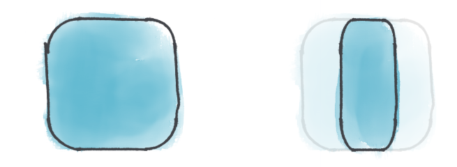
Animer width et height en css sans se prendre la tête et plus rapidement avec transform.
Les animations de propriétés provoquent un reflow de la page alors que transform et opacity ne le font pas: c'est un point en leur faveur. Problème, si on étire une boîte arrondie (transform: scale), les coins se déforment alors que si on change la taille (width/height), les coins restent arrondis.
L'auteur propose une solution qui consiste à étirer tout sauf les coins en divisant l'élément en plusieurs divs... ça me rappelle l'époque où border-radius n'existait pas et qu'on faisait les coins arrondis en multipliant les divs avec des fonds... #teamVieux
Styler les inputs radio/checkboxes de façon sémantique, accessible, moderne, customisable et vanilla, c'est possible !
Avec un mélange de variables css et appearance.