


7 Practical Tips for Cheating at Design – Refactoring UI – Medium
En résumé:
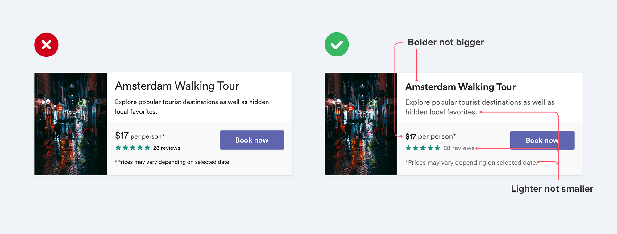
/* Emphasis: don't play with sizes, use weight & colour !*/
.text-important{
        font-weight:700;
        color:hsl(0,0%,17%)
}
.text-normal{
        font-weight:400;
        color:hsl(0,0%,40%);
}
.text-less-important{
        font-weight:400;
        color:hsl(0,0%,45%);
}
/ on coloured background: use opacity to avoid grey on colour/
.text-on-colour{
color:hsla(0,0%,100%,0.6);
}
/ add vertical offset on shadows instead of increase blur/
.shadow{
box-shadow: 0 4px 6px 0 hsla(0,0%,0%,0.2);
}
.inset-shadow{
box-shadow: 0 2px 4px 0 hsla(0,0%,0%,0.08);
}
/ avoid borders if you can and replace it with
. a shadow
. different background colour
. extra space
/
.dialog-box{
border:0;
box-shadow: 0 4px 6px 0 hsla(0,0%,0%,0.2);
}
.footer-dialog{
background: hsl(0,0%,98%);
}
.category-p{
margin-bottom:48px;
}
/ don't oversize one-coloured icons: 16px -> 24px max; /
[class^="icon-"]:before, [class*=" icon-"]:before {
font-size:20px;
}
/ accent borders on focused, active or important boxes  /
div.important{
border-top:6px solid #40A4F4 /blue/;
}
}
li.important{
border-left:6px solid #40A4F4 /blue/;
}
.important-inlineblock{
border-bottom:6px solid #40A4F4 /blue/;
}
body.cooool{
border-top:6px solid #40A4F4 /blue/;
}
/ use background color for button only if semantic:
. positive action: green
. delete something: red;
. normal, not important or not the preferred action: TRANSPARENT;
/
.btn-danger{
background-color:red;
color:white;
}
.btn-success{
background-color:green;
color:white;
}
.btn{
background-color:transparent;
color:hsl(0,0%,40%);
}
❝ 1 commentaire ❞
Fil RSS des commentaires de cet article
✍ Écrire un commentaire
les commentaires relevant du SPAM seront filtrés et dégagés direct...